Partner Portal
Desktop and Mobile Web App: 2022-2024

Role: Lead UI/UX Designer
Team: Project Manager, 2 Developers, 1 UI/UX Designer
Timeframe: Sep 2022-Oct 2024
Tools: Figma, FigJam, Miro, Illustrator, Tableau, Jira
Team: Project Manager, 2 Developers, 1 UI/UX Designer
Timeframe: Sep 2022-Oct 2024
Tools: Figma, FigJam, Miro, Illustrator, Tableau, Jira
Project Results:
148
→ 87
Average days to integrate new app (40% Decrease)
28
→ 10
Average emails exchanged per new app (75% Decrease)
The Problem
With Success Comes Challenge
VIDAA is a mid-size smart TV OS platform available on major television brands such as Hisense and Toshiba. Recently, they've been partnering with major brands such as Netflix and HBO to bring high profile streaming content to the network. With the addition of these major brands, they have started attracting a large number of smaller apps and streaming services wanting to find a place on the VIDAA tv platform.
The Partner Engagement team was overwhelmed by the influx of interest in the platform and was having trouble processing all the new submissions. App integration time was too high, and while more personnel could help ease the problem, the lack of a dedicated suite of partner tools was identified as the primary issue.
The Partner Engagement team was overwhelmed by the influx of interest in the platform and was having trouble processing all the new submissions. App integration time was too high, and while more personnel could help ease the problem, the lack of a dedicated suite of partner tools was identified as the primary issue.
5 Months
Average time to integrate new app
28
Average number of emails exchanged during integration
5 Days
Average time between email responses
VIDAA partners need a faster way to integrate new apps, because currently the process is tedious and relies too heavily on email correspondence.
My process: Design Thinking
1
EMPATHIZE
2
DEFINE
3
IDEATE
4
PROTOTYPE
5
TEST
6
ITERATE
1
Background Research
::Empathize
Current Integration Process
In order to understand the problem, I first needed to learn how the app integration process is currently preformed. I interviewed members of the Partner Engagement team so that I could get a better understanding of how apps are integrated into the VIDAA ecosystem. Based on my conversations, I mapped out the process as it currently exists.
First I created a flow for the “ideal” integration as it was explained:
First I created a flow for the “ideal” integration as it was explained:

Every time the line of action crosses from the partner to the user and vice versa it creates a communication delay. Some crossings take longer than others, such as the time taken for partners to develop their app and make changes to files, but an average of 5 days was the number chosen by our stakeholders for measuring KPI’s.
However, reality is far from “ideal”. In addition to the interviews, I obtained email chains between the Partner Engagement team and partners documenting the integration process. After revewing these, I mapped out a flow that more closely resembled reality:

A more typical user flow involves a large amount of back and forth communication about the process and error correction, drastically increasing integration time.
With a more realistic flow, “Clarification Loops” presented themselves- areas where either confusion regarding technical specifications or problems with file uploads would create multiple extra emails, often causing significant delays.
User Interviews
I used the information collected from the Partner Engagement Team as a foundation for survey questions for the group of users that I had gathered. I asked questions to gather both quantitative and qualitative data on their experience using VIDAA’s app integration process and asked them to compare it to their experience with other platforms.
Key Findings:
• ALL Users Expressed frustration at the number of emails involved in the app integration process
• 5 Users Complained that VIDAA’s integration process takes significantly longer than other companies
• 4 Users Mentioned that the technical documentation sent with the initial instructional email was insufficient
• 2 Users Said that the testing results were unclear or lead to confusion
• 2 Users Requested the ability to view app status and metrics once their app is live
• 1 User Commented that managing multiple apps was extremely difficult
2
Personas and Journey Maps
::Define
I built personas based on the different roles I spoke with. I created one to represent less experienced users who will generally only ever deal with integrating a single app, and another to represent power users who deal with high volumes of apps. The existing app integration process was only designed to handle the former; any solutions would need to cater to both.


3
Solutions
::Ideate
During my interviews with the partner engagement team, I learned that there were an average of 30 emails sent back and forth before an app would be available. As part of the ideation process, I categorized their content and used them to generate further opportunities for their elimination:
Email Content
Opportunity

Instruction/Procedure Clarification
- The platform can feature a documentation library with detailed instructions on every aspect of the app development process
- Email could be replaced by an internal messenger

Issue Clarification Request
- Test result descriptions can be more descriptive and be detailed in a documentation library

Metadata Typo/Error Correction Request
- Instead of having partners submit a JSON form, App metadata can be created using web forms with live data validation

Testing Results
- Rather than emailing test results, there should be an app testing interface including testing history and downloadable reports

Status Inquiries
- Testing and app progress and app status indicators can be visible at every step of the app integration process

File Exchanges
- All files and forms can be uploaded from the web platform
Using the insights I’d gathered, I built a new user flow for the platform. Relying on web forms and uploaders, this new design avoids nearly all email exchanges:


The MVP
By this stage we had a growing number of features we wanted to implement. In order to keep our objectives grounded, we needed to establish a feature list for the MVP. We decided that the first round would be limited to features relating to app uploading and testing, with post-integration features, such as live app KPI’s and metrics, being the subject of a second round of design once the platform was live.
I collaborated with the developers to discuss a reasonable feature list for the MVP and used this to inform a sitemap.
I collaborated with the developers to discuss a reasonable feature list for the MVP and used this to inform a sitemap.
Ideation Exercises
Sketches are a low investment way of rapidly experimenting with ideas. They’re a way for me to play with different ways of arranging elements and ideas before building Figma screens to share with my team.
I conceptualized a few of the screens from our sitemap, including an app profile screen. This screen would serve as a hub for all actions and information related to a partner’s app and would directly address the pain points related to ambiguous status and process visualization.
I conceptualized a few of the screens from our sitemap, including an app profile screen. This screen would serve as a hub for all actions and information related to a partner’s app and would directly address the pain points related to ambiguous status and process visualization.

4
Wireframes & Mockups
::Prototype
I started the prototyping process with a series of wireframes. These translated the ideation exercises that I’d previously performed into designs into Figma designs that could be rapidly modified and iterated upon. These screens started as low fidelity wireframes, gradually increasing in detail as they underwent evaluation by the project manager and developers.

5
Usability Testing
::Test
I used the low fidelity prototype to conduct another testing run with a small group of users. Overall, users understood the designs and said that they looked similar to platforms that they’ve used with other companies.
I ran a similar test with the partner engagement team to ensure that the integration forms aligned with the requirements that they needed to launch a new app. While we got plenty of feedback regarding this flow and specific functionality issues that needed to be addressed, they said that overall the design was in line with their needs.
I ran a similar test with the partner engagement team to ensure that the integration forms aligned with the requirements that they needed to launch a new app. While we got plenty of feedback regarding this flow and specific functionality issues that needed to be addressed, they said that overall the design was in line with their needs.
Design System

I noticed that, while the VIDAA smart TV product had a defined design system, internal tools did not. Each project typically had its own set of components, giving them each a distinct look with little thought to the cohesion between them.
I raised this issue with the Global Head of Design and was tasked with finding a suitable design system, as well as leading an initiative to see it adopted by both designers and developers. This proved to be a challenge, as we didn’t have the budget to create one from scratch or license an expensive one. Additionally, each project was built on a different front-end framework and developers from other teams were reluctant to spend time rebuilding these interfaces from the ground up.
I was eventually able to find a compromise between design aesthetics and developer priorities by selecting a Bootstrap based system licensed for commercial use, since this was the most common framework used on our internal tools.
I established a component hierarchy between the master file, a VIDAA customized design system file, and individual project files. Once this was done, I could begin applying the design system to my own designs and updating the prototype.

6
High Fidelity Prototype
::Iterate

Taking the results from the usability tests, I was able to make some navigation and UI changes to the prototype before rebuilding it using the new components from the design system.
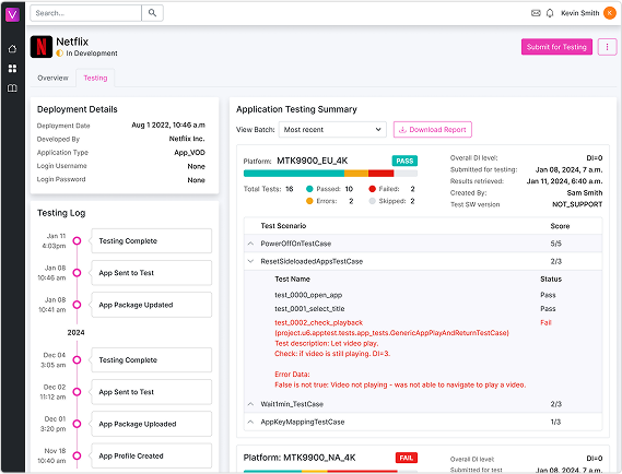
Live Testing Status
In order to address pain points related to testing and feedback ambiguity, we built a testing section within the app profile. From this screen, users can see the status of ongoing tests, as well as download the results of previous tests. Issues are grouped into scenarios, which are further detailed in the documentation library.
In the first round of testing, users complained that the test results were hard to read, and they weren’t sure what the “View Batch” and “Download Report” functions were. By focusing on the information hierarchy and relative spacing of the elements, users no longer had the same issues with the high fidelity prototype.
In the first round of testing, users complained that the test results were hard to read, and they weren’t sure what the “View Batch” and “Download Report” functions were. By focusing on the information hierarchy and relative spacing of the elements, users no longer had the same issues with the high fidelity prototype.


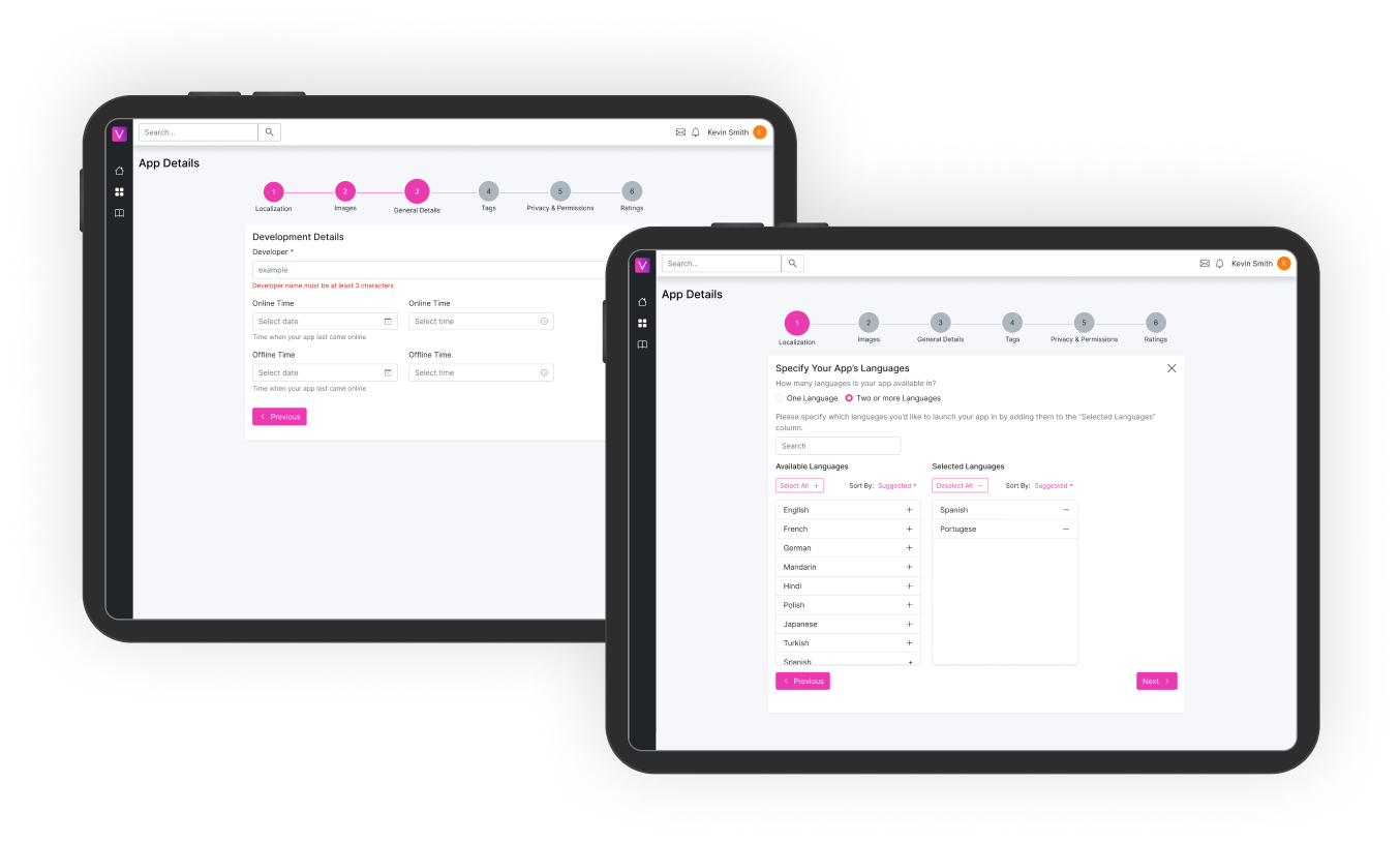
Responsive Design
Some partners stated that while they wouldn’t use a mobile version for the uploading and testing portion of app integration, they would likely use their phone or tablet to check messages and testing updates while away from their PC. I used this insight to inform the design of the responsive portions of the platform, ensuring that navigation to these elements was quick and seamless.
Eliminated Ambiguity
Before the project, App metadata was created and delivered via a 20 field JSON file that partners would need to create manually. This introduced ample room for typos and other errors. By replacing this process with step by step forms featuring instant validation, any room for potential errors such as these was eliminated.
Results
KPI monitoring over 6 months revealed a dramatic drop in both the app integration time and total number of emails exchanged.
Of the emails that remained, most were inquiries about the process and technical specifications, which were usually resolved by linking to existing documentation pages.
Some email types, such as file exchanges and testing results were completely eliminated.
Some email types, such as file exchanges and testing results were completely eliminated.
148
→ 87
Average days to integrate new app (40% Decrease)
28
→ 10
Average emails exchanged per app (75% Decrease)
Moving Forward
While we were satisfied that the majority of the user pain points had been resolved on some level, there were still many that were unaddressed. User surveys showed an overall favorable view of the platform (3.9/5), but users still wanted more transparency and app monitoring tools that were present on other platforms.
We began another round of design, this time focused on post-launch pain points and features.
We began another round of design, this time focused on post-launch pain points and features.